Medly
Medly is a smart medication tracking app designed to improve adherence through clarity, structure, and behavioural support. Built around positive reinforcement and friction-free daily habits, it delivers a calm, intuitive health experience for patients managing ongoing medication regimens.
Client
Medly
Industry
Healthcare Technology
Service
UX Research & Mobile App Design
Duration
3 Months

OVERVIEW
Medly is a mobile-first medication tracking experience designed to solve one of healthcare's most persistent problems; non-adherence. Built for patients managing chronic conditions and the caregivers supporting them, Medly combines automated reminders, progress visibility, and positive reinforcement into a single, low-friction daily experience. The product covers the full patient journey, from first-time onboarding and medication setup through to daily tracking, dose confirmation, and long-term adherence insights.
THE CHALLENGE
Medication non-adherence affects 50% of patients with chronic conditions globally, leading to preventable complications and poor health outcomes. Existing apps addressed the symptom; missed doses, without understanding the cause. They were either too clinical and overwhelming for everyday users, or too simple to handle complex multi-medication schedules. The deeper problem wasn't forgetfulness alone. It was friction at setup, guilt-driven reminder systems, and a complete absence of positive reinforcement. No existing product made consistent medication habits feel achievable or rewarding.
THE RESEARCH
Before opening Figma, I invested heavily in understanding the problem space. - Secondary Research: I reviewed WHO adherence data, behavioural science literature on habit formation, and existing studies on digital health intervention effectiveness. Key finding: the most successful adherence interventions shared three traits; reduced cognitive load, visible progress, and positive reinforcement over punishment. - Competitive Analysis: I audited 5 existing medication apps: Medisafe, MyTherapy, Roundhealth, Apple Health, and CareZone. I evaluated each across onboarding friction, reminder flexibility, progress visibility, and emotional tone. Key gaps identified: 1. All five front-loaded setup before demonstrating value, 2. None used consistent positive reinforcement language, and 3. Progress tracking was either absent or buried. - User Interviews: I conducted in-depth interviews with 8 participants across two segments: patients managing chronic conditions (diabetes, hypertension) and caregivers managing medications for dependents. Core insights that emerged: "I know I should take it but I genuinely forget, there's nothing in my environment that reminds me at the right moment" - forgetfulness driven by context, not intent. "The app I tried had too many steps just to add one tablet,I gave up" - setup friction as the primary drop-off point. "I want to see that I'm doing well, not just be told when I've missed" - desire for progress visibility over punishment. - Affinity Mapping: I synthesised all interview findings by clustering observations into five themes: Setup Friction, Reminder Fatigue, Progress Invisibility, Emotional Tone, and Caregiver Complexity. This structured the problem space and directly prioritised what to solve first. - Personas: Two primary personas emerged from the research; Omah, 34 - Chronic condition patient, busy professional, motivated by visible progress, frustrated by clinical interfaces. David, 52 - Caregiver managing an elderly parent's medications, needs simplicity and reassurance above everything else. Jobs To Be Done - When I wake up, I want to know exactly what I need to take so I don't have to think about it. - When I take a dose, I want to confirm it quickly and feel good about it. - When I've been consistent, I want to see that progress so I stay motivated. - When I miss a dose, I want to be informed without feeling guilty.
THE SOLUTION
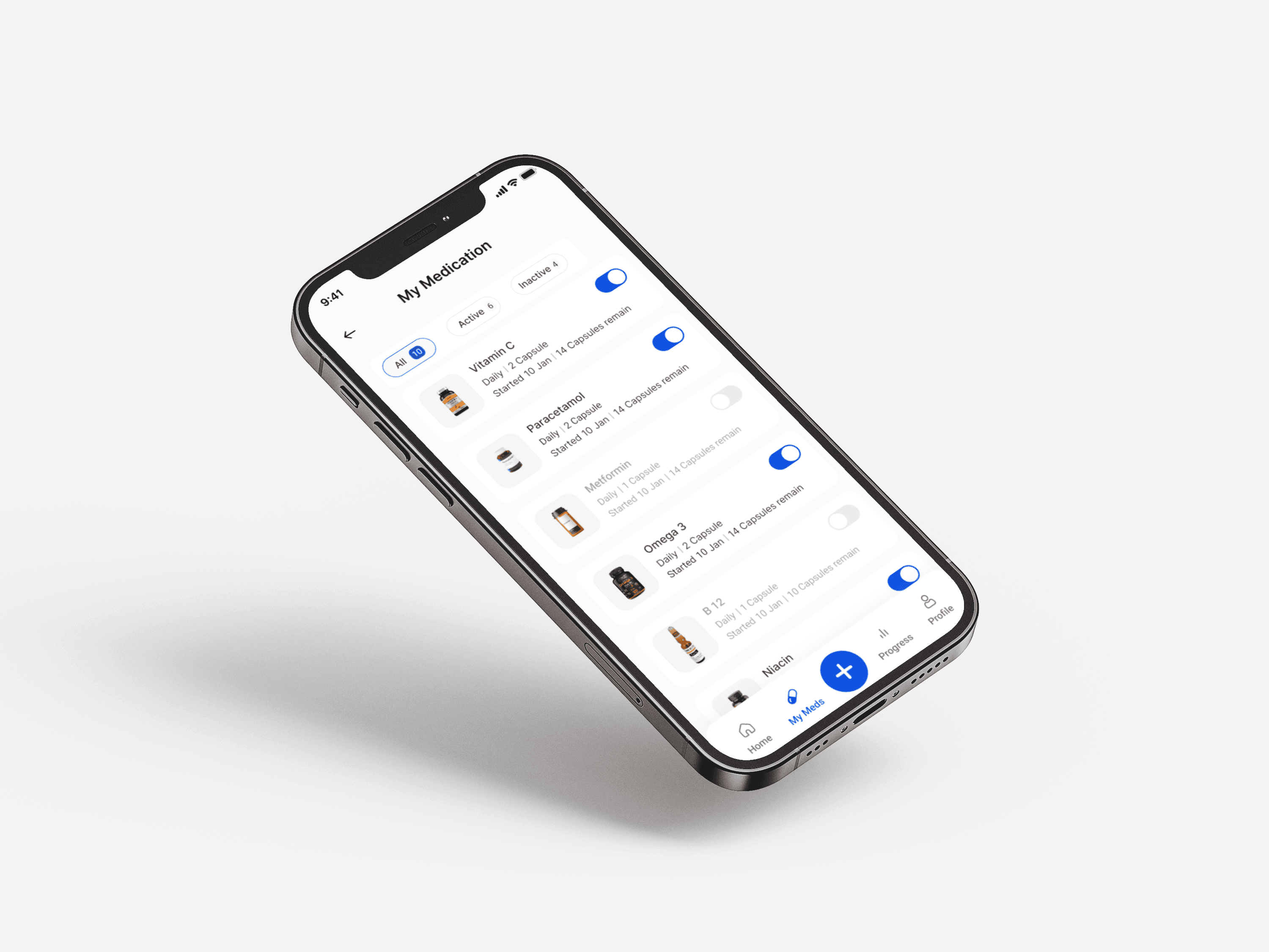
The research reframed the entire product. Medly wasn't a reminder app, it was a behavioural support system. Every design decision that followed traced back to one of the three principles established from research: reduce cognitive load, make progress visible, and lead with positive reinforcement. - Information Architecture: I mapped the full product across five core areas: Onboarding, Dashboard, My Meds, Progress, and Profile, ensuring every user goal identified in research had a clear, direct path with no dead ends. - User Flows: Detailed flows were designed for first-time onboarding and medication setup, daily tracking (take, skip, snooze), adding a new medication mid-use, viewing adherence history, and managing reminders. - Wireframing: Low-fidelity wireframes explored layout hierarchy and information density before any visual decisions were made. Key structural decisions at this stage: the dashboard leads with today's status before listing medications, and medication cards use a single-tap confirmation to eliminate unnecessary steps. - Visual Design: The design language was built around calm confidence soft blues, clean white space, and clear typography to reduce the clinical anxiety commonly associated with health apps. "You're on track today" became the primary dashboard headline, establishing a positive frame before presenting the task list. Colour coding (green for taken, amber for due, muted for inactive) gave users instant status at a glance without reading a single word. - Design System: A component library was built covering buttons, medication cards, toggle states, progress rings, navigation bar, reminder modals, and typography scale, ensuring full consistency across all screens and enabling fast iteration during testing.
THE RESULT
Medly was validated across two rounds of moderated usability testing with 9 participants total. Round 1 findings: - 4 of 5 users completed medication setup without assistance; confirming the reduced-friction onboarding worked. - 2 users missed the "Skip for now" CTA on the reminder screen; too low contrast. - 1 user was confused by the difference between the dashboard and the My Meds screen. - All 5 users responded positively to the "You're on track" headline described as motivating and reassuring. Iterations made: Increased contrast and size of the skip CTA, added a subtle label clarifying the dashboard as today's view vs My Meds as the full list, and adjusted medication card hierarchy to surface dose time more prominently. Round 2 results: All core tasks completed without confusion across 4 new participants. No critical usability issues identified. 100% task completion rate on all core flows.


Conclusion
Medly reinforced something I already believed; The most important UX work happens before you open Figma. The research revealed that the real barrier to medication adherence wasn't lack of information, it was lack of motivation and too much friction at every touchpoint. Shifting the frame from a tracking tool to a behavioural support system changed everything; the information architecture, the visual language, the copy, and the interaction design all followed naturally from that one research-driven insight. This project deepened my approach to designing for sensitive, high-stakes contexts where clarity and emotional tone are just as important as functionality, a standard I now carry into every healthcare and fintech brief.